

Choose an October Paint-by-Numbers Project by Palette, Not Destination
Choose the Winter Light Festival paint-by-numbers kit for its cool blue-and-violet light pattern, not because the scene is in Reykjavik. The image has dark building and sky areas interrupted by bright architectural lights, so it suits an October palette built around high contrast rather than orange leaves.
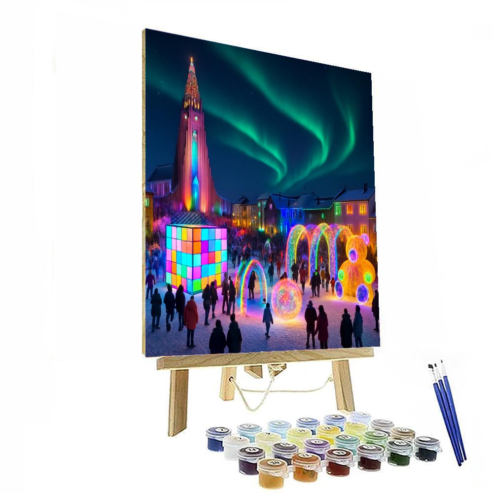
A palette reading of this exact canvas
Look at the product image in three zones: the dark sky, the illuminated building edges, and the reflected colour near the lower part of the scene. From across a room, the bright linear lights will read before the smaller architectural details. That makes the project a useful choice when the intended display gap needs a dark field with concentrated colour—not merely a travel image.
Make the space decision before the painting decision
The painted canvas area is listed as 40 × 50 cm, with an extra 4 cm around the canvas for optional framing. Before ordering, cut a 40 × 50 cm paper rectangle and place it in the intended spot. Then add a 4 cm border around that mock-up if the extra canvas edge matters to the planned frame.
- View the mock-up in daylight and under the lamp used in October evenings.
- Decide whether the room needs concentrated bright accents or a more evenly light composition.
- Confirm there is a flat work surface larger than the canvas and separate storage for the acrylic paint set and three brushes.
The listing does not provide a difficulty rating or completion time. The image can support a palette choice, while only the painter’s pace can determine the schedule. That distinction keeps the selection specific without turning visual detail into an unsupported promise about effort.